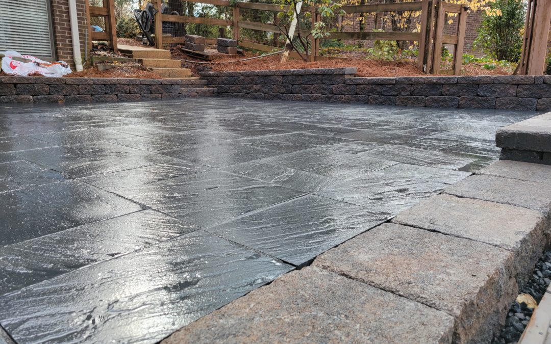
It’s normal for homeowners to carefully choose their color choices for bedrooms and other living spaces. The outside color of the house is always important too. It should be the same with hardscape color choices. Patio pavers come in an array of colors. These should be carefully considered before making a final choice. Homeowners need to take into account the colors that already create a thematic tone across their exterior design. Is there a style choice that should be complemented? That is, is the overall ambiance one of country charm? Is the idea to create a more sophisticated and modern feel? Besides these questions, it is important to remember that lighter colors reflect natural light and therefore naturally amplify the space where they are positioned. So, go for lighter pavers when the goal is to make an area seem larger. Darker pavers are useful too. They can convey coziness or make it harder to see stains in areas of high usage, like a barbecue area. Single color areas tend to look more modern. Meanwhile multi-colored areas can be busy. Neutral tones are good for areas designed for meditation or relaxation.
Key Takeaways:
- Non-tumbled pavers with minimal lines and a gentle gray would add a peaceful element to a garden meant for relaxation or meditation.
- A patio paver in a lighter color reflects light better. This makes the space feel more amplified.
- Pick pavers that go with colored elements you already have. Or go for pavers that create a theme you already embrace, like rustic, or contemporary.
“Whether you’re installing patio pavers, a fire feature or building a retaining wall, you want to choose a color that is in harmony with the style and color scheme of your house, fits into your existing landscape, and makes sense for how you’ll use the space.”
Read more: https://www.baysidepavers.com/blog/how-to-choose-the-right-color-when-installing-your-patio-pavers